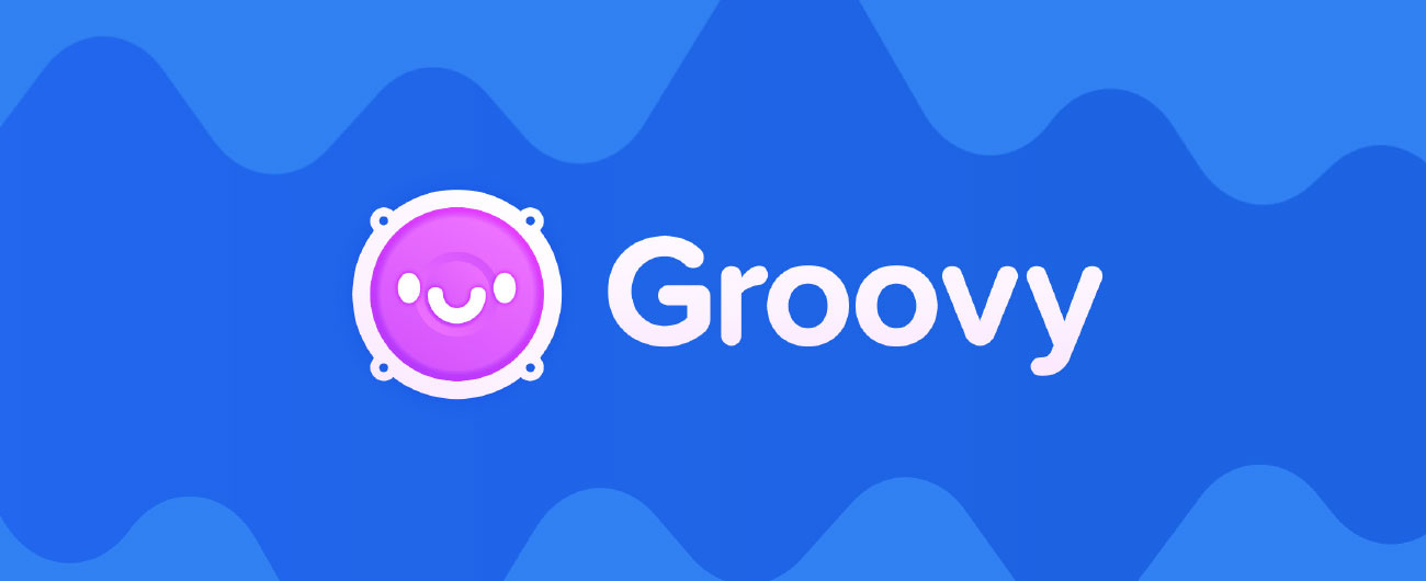
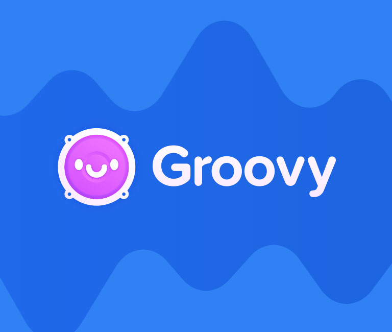
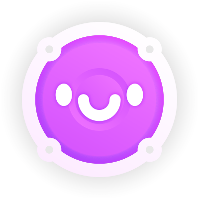
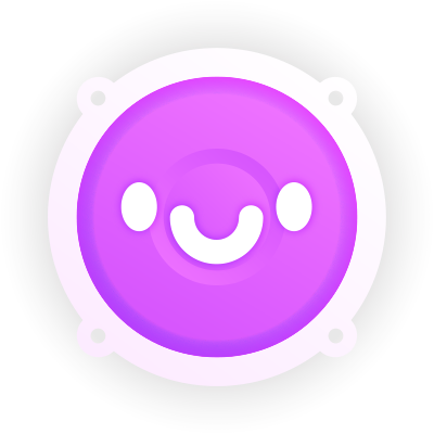
Get In Touch
[email protected]
July 1, 2021

Groovy Bot

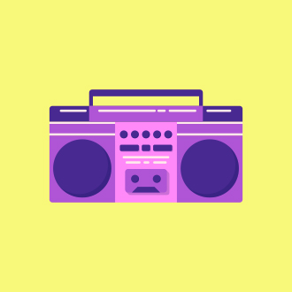
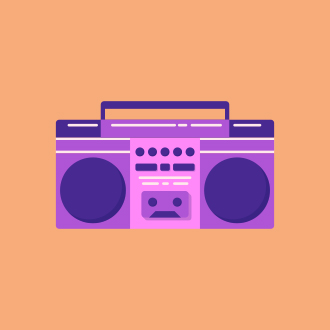
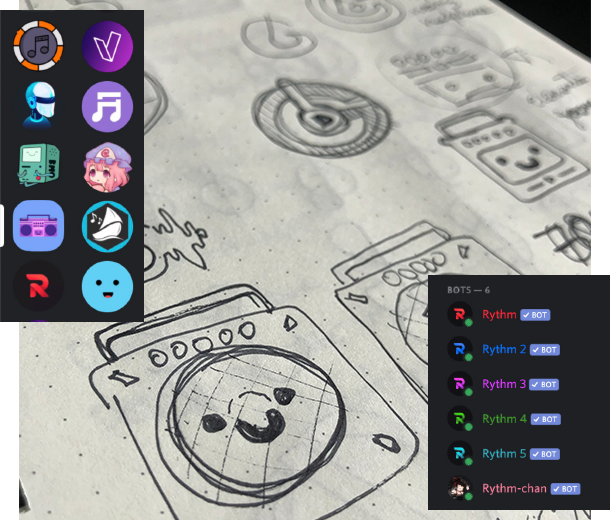
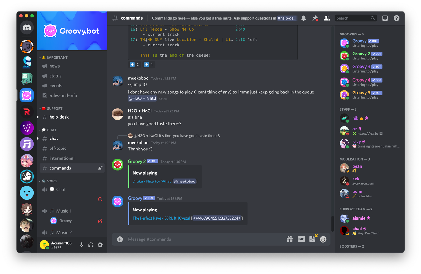
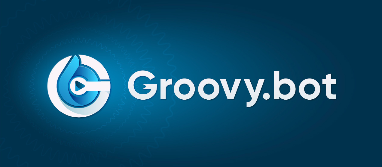
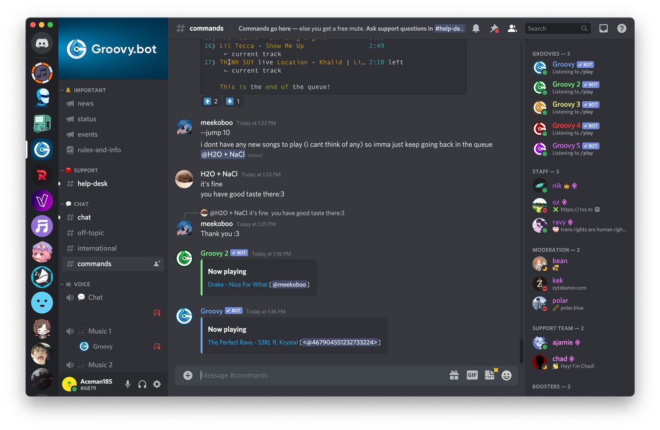
Working closely with the creator of Groovy Bot, I was tasked with modernizing the look and feel of the bot, as well as redesigning it to fit more comfortably in/be more recognizable in the small confines of the Discord app. This redesign also needed to accommodate for different variations of the central design as there were 3 versions of Groovy Bot with plans to add 2 more. A new logo and accompanying wordmark was designed and signed off on, but unfortunately before it could be launched the Groovy Bot service was issued a cease and desist from YouTube. Enjoy the process behind what would’ve been Groovy Bot 2.0.

Task

Rebrand one of the most popular bots on Discord with the goal of creating multiple versions for the various bots.

  • Strategy

    Brand Strategy

  • Design

    Brand Design

  • Client

    Groovy Bot Incorporated

  • Tags

    Branding

Groovy Bot

15 Millions Servers, 500+ Million Users. Where Do You Start?

Groovy Bot 1
Groovy Bot 2
Groovy Bot 3
Groovy Beta

Groovy Bot

Survey Questions
& Results.

Groovy Bot

Competitors & Concept Development.

Before concepting began, I researched the branding and general experience behind some of the other top bots. I joined their Discord servers, interacted with their communities, and explored their brand design. As a key portion of this project was to develop a logo that supported variations, I paid close attention to this during research. I found that most used colour to separate their bots, and some had created character based versions. These separate bots were offered to premium members, and would allow large servers (typically thousands of members) to use multiple bots in different voice channels. That may sound confusing, but to sum it up: one voice chat might want to listen to rap, and one might want rock. Each needs a bot, and the free version only allows one per server. My concepts explored various icon and lettermarks that I later expanded upon.

Groovy Bot

Logo Version 1.

With version 1, I looked for ways to retain pieces of the boombox while also redesigning it to fit comfortably in a circle. I also used similar colors to the original and focused on providing a fun and recognizable icon through bolder colours that users would still associate with Groovy. Many people felt the tape deck in the original logo looked like a face, so I focused on that with this concept and personified the bot inside of a large speaker.

Groovy Bot

Graphic Element.

This interpretation of sound waves was designed to be used in a multitude of ways. Through a variety of layering effects, it is adaptable and unique. On its own, this background element is made up of multiple layers within layers of blurred and stacked sound wave elements. This gives off a light Vapourwave vibe that simultaneously brightens and relaxes any scene it’s in. It can also be blended into colored backgrounds to provide depth.

Groovy Bot

Logo Version 2.

With version 2, I wanted to illustrate that a text based icon could be more than just a letter G in a circle, which was a fear of the clients’. Through layering and cut-outs, this becomes as much of an icon as it is a combination of letters. I pushed for a more obvious play of light and shadows along with the use of the Groovy Bot initials, all of which is built to reference a CD and a play button.

Groovy Bot

Graphic Element.

A differing interpretation of sound waves, this circular element is constructed to highlight a particular piece of an image. Circular in nature, these elements are meant to be combined with a point of interest, drawing the eye naturally towards the center. The sound waves themselves begin to blur as they expand further away from the center, and one can use as many or as little as desired, depending on the application.

Groovy Bot

Version 1 Was The Ultimate Winner.

Groovy Bot

Accompanying Pattern & Developer Versions.

Contact Me

Do You Have A
Project Or Website
You Need Help With?